Understanding Business Card Design
Business card design plays a crucial role in establishing and reinforcing a company's brand identity while serving as a practical tool for professional communication. A well-crafted business card not only provides essential contact information but also visually communicates the company’s values, personality, and level of professionalism. In a competitive marketplace, the design elements of a business card should align with the overall branding strategy, ensuring consistency across all marketing materials.
Key elements in effective business card design include clear typography, a balanced layout, and the strategic use of color. These components must work harmoniously to create a memorable impression while maintaining readability and accessibility. Industry standards advocate for a clean, uncluttered approach that minimizes distractions and emphasizes the core information.
In addition, consistent incorporation of logo and brand visuals reinforces recognition and trust. The consistency of design across different business cards and digital platforms also contributes to a cohesive brand image. When executed correctly, a thoughtfully designed business card can become an extension of your brand, leaving a lasting impact on recipients.
It is important to recognize that business card design is more than just aesthetics; it is about functional communication. Elements such as font size, typeface choice, and spacing have a direct impact on how easily contact details can be read. Industry best practices recommend avoiding overcrowding and choosing fonts and sizes that foster quick recognition.
Furthermore, understanding industry standards for size and shape ensures compatibility with wallets, cardholders, and digital scanning equipment, promoting ease of use. Customized business card designs often incorporate creative visual elements that distinguish a brand while adhering to these basic structural guidelines.
Choosing Layouts and Structures
Effective business card design begins with selecting an appropriate layout that aligns with the brand's identity and communicates contact information clearly. Layout options encompass orientation choices—vertical or horizontal—each offering distinct advantages depending on the desired aesthetic and space considerations. A vertical layout can lend a modern and bold appearance, enabling the placement of vertical text or aligning elements in a distinctive format, whereas a horizontal layout tends to be more traditional and familiar to recipients.
Grid systems serve as fundamental guides in structuring the placement of design elements, ensuring a balanced and organized appearance. Utilizing a grid allows for precise alignment of text, logos, and visual components, promoting visual harmony and reducing clutter. This organization enhances the readability of key contact details, making it effortless for recipients to capture essential information swiftly.
The structural hierarchy established through strategic placement reinforces the importance of specific elements—such as the company logo, name, and contact information—guiding the viewer’s eye naturally across the card. For example, positioning the logo at a prominent corner or center draws immediate attention, while contact details can be organized in an accessible manner along the lower section.
In addition to conventional layouts, asymmetrical designs and creative structuring can introduce visual interest and brand personality, provided they maintain clarity and ease of use. Experimenting with overlapping elements or unconventional spacing may enhance uniqueness but should not sacrifice legibility.
The influence of layout choices extends into practical considerations, such as ensuring sufficient white space to prevent overcrowding and facilitate quick information recognition. This balance between aesthetic appeal and functionality is crucial in designing a business card that effectively serves its purpose.

Proper Use of Space and Element Placement
Allocating space thoughtfully among textual and visual elements ensures that your business card remains uncluttered while conveying all necessary details. Maintaining readability involves choosing font sizes and weights that are legible across various viewing distances, particularly for contact information. Grouping related elements logically enhances comprehension—for instance, aligning phone numbers and email addresses together. Strategic placement of logos and branding visuals should prioritize visibility without overshadowing contact details. Using negative space around key elements accentuates their importance and guides the viewer’s focus. A well-structured business card uses margins and padding to create breathing room around content, preventing a cramped appearance. This technique improves aesthetic balance and ensures that the design remains adaptable for different printing specifications and digital formats. Ultimately, combining a clear hierarchy with precise element placement results in a professional design that communicates confidence and trustworthiness. Investing in layout planning ensures that your business card effectively fulfills its role as a tangible extension of your brand—facilitating connections and leaving lasting impressions.
Understanding Business Card Design
Effective business card design hinges on a harmonious balance between visual appeal and functional clarity. The core objective is to create a professional representation of your brand that leaves a memorable impression while facilitating seamless information exchange. Every element on the card—be it typography, imagery, or layout—must work cohesively to communicate your message clearly and concisely.
Color schemes should align with your brand identity, using hues that evoke the desired emotional response and ensure consistency across all marketing collateral. Typography choices, on the other hand, must prioritize readability; select fonts that are legible at smaller sizes and maintain a uniform style throughout. Combining different font weights can help emphasize key details, such as your name or job title, without overwhelming the design.
Incorporating branding elements like logos and specific visual motifs reinforces brand recognition and enhances visual cohesion. Strategic placement of these elements is vital—logos are often positioned at the top or corner, creating a focal point that guides the viewer’s eye naturally across the card. The size and prominence of the logo should reflect its importance while avoiding overpowering essential contact details.
Material selection plays a crucial role in both the tactile experience and the overall impression. Premium card stocks, textured finishes, or unique materials like transparent or metallic papers can elevate your business card from ordinary to exceptional. Finishing techniques such as matte, gloss, or soft-touch coatings not only enhance durability but also contribute to the card’s aesthetic appeal.
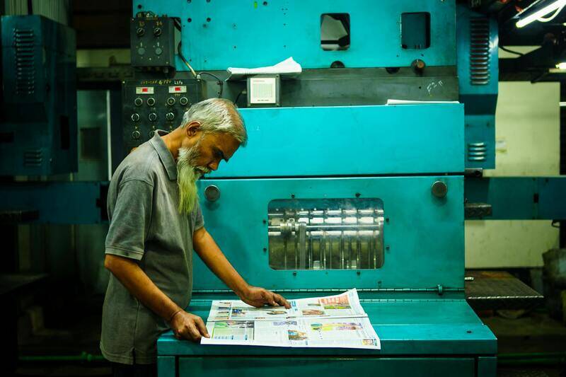
Considering the method of printing is equally important—digital printing offers fast turnaround and cost efficiency for small runs, while offset printing might be more suitable for larger quantities with high-quality results. Both options allow for customization in terms of cut shapes, embossing, foil stamping, and other special effects that add sophistication and visual interest.
When designing digital business cards or utilizing QR codes, ensure that these elements are integrated seamlessly into the overall design. Proper sizing and placement enable recipients to access your digital profiles or websites effortlessly, reinforcing connectivity in a digital-first environment.
Adaptability is a key factor. Functional design must consider different formats for handheld devices and physical cards, ensuring that critical information remains legible across diverse platforms. By meticulously planning each component—from color palettes to finishing touches—you create a comprehensive design that encapsulates professionalism and strengthens your brand identity.
Understanding Business Card Design
Effective business card design serves as a visual extension of your brand, conveying professionalism, credibility, and personality in a compact format. It involves more than just aesthetics; it requires a strategic approach to layout, content placement, and visual hierarchy to ensure key information is highlighted and easily accessible. When crafting a business card, every element from the choice of fonts and colors to spacing and material considerations plays a pivotal role in creating an impactful impression. A well-designed business card should not only reflect your brand identity but also promote easy comprehension and facilitate meaningful connections. The process begins with defining the core message you want to communicate and aligning your visual elements accordingly to create consistency across all branding materials.

Choosing Layouts and Structures
Designing the layout is fundamental in business card creation. The structure must accommodate all essential information while maintaining visual harmony. Options range from minimalist styles, which emphasize clean lines and ample white space, to more detailed layouts that incorporate multiple elements like icons and images. Common structural choices include horizontal and vertical formats, depending on the branding style and the impression you wish to give. Prioritization of information is vital: typically, your name and profession are most prominent, followed by contact details and company branding elements. Utilizing grids and alignment guides helps organize these components effectively, ensuring the card appears balanced and professional. Consider the natural flow of information; for instance, placing your logo and key contact details in strategic positions allows for quick recognition and easy retrieval. Experimentation with asymmetry or asymmetrical alignments can also create a dynamic appearance, setting your card apart in a crowded marketplace.
Utilizing Visual Hierarchy
Establishing a clear visual hierarchy guides the viewer’s eye through the information in a logical sequence. Use size, color, and font variations to emphasize important details such as your name and contact number. Less critical information can be smaller or presented with subdued colors to avoid distraction. Strategic spacing between elements prevents overcrowding and maintains clarity, which is essential for readability regardless of whether the card is viewed in person or digitally. White space plays a crucial role in borderless designs, helping to frame content without clutter, and contributing to an overall aesthetic that feels modern and refined.

Choosing Colors and Typography
Color selection significantly influences the perception of your business card. Colors should align with your brand identity and evoke specific emotions or associations. For instance, blue conveys trust and professionalism, while red suggests energy and passion. Use a limited palette to maintain cohesiveness, typically sticking to two or three primary hues, complemented by neutral tones such as black, white, or gray. Contrast is key: ensure that text stands out against background colors for maximum legibility. Employing consistent branding colors across all marketing materials enhances recognition and reinforces your corporate identity.
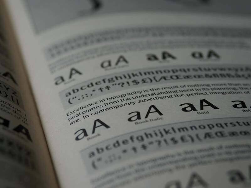
Typography choices also impact the perception of your brand. Selecting clean, legible fonts ensures information is accessible at a glance. Combining a serif font for headings with a sans-serif for body text can create a sophisticated look, but consistency is crucial. Font sizes should be optimized for readability; typically, names and main contact details are slightly larger than supplementary information. Maintain ample line spacing and avoid overly decorative fonts that detract from clarity. Attention to typographic hierarchy—using variations in size and weight—helps direct attention to the most important elements on your card.
Integrating colors and typography thoughtfully enhances visual appeal, making your business card a memorable and compelling representation of your brand. The goal is to strike a balance between aesthetics and functionality while reflecting your company's ethos and style standards.
Understanding Business Card Design
Designing an effective business card requires a strategic approach that emphasizes clarity, professionalism, and brand consistency. It is essential to focus on creating a visual identity that immediately communicates your company's ethos and values. This process involves selecting a layout that facilitates easy reading and highlights key information without appearing cluttered or overwhelming. Consider this step as a foundation for the entire design, as a well-structured layout enhances the overall aesthetic and ensures your contact details stand out.
Choosing Layouts and Structures
Effective business card layouts serve both functional and aesthetic purposes. Common structures include horizontal and vertical orientation, each offering distinct advantages depending on your branding style. Horizontal layouts are traditional and widely accepted, providing ample space for contact details and logos, while vertical designs introduce a modern twist that can make your card stand out. Additionally, grid-based layouts support organized placement, facilitating a balanced distribution of elements such as logos, names, titles, and contact information.
Whitespace, or negative space, plays a crucial role in layout design. Adequate spacing prevents the card from appearing overcrowded and directs attention to key elements. Using sections or blocks to segregate information can improve clarity and ease navigation for the recipient. Keep in mind the importance of alignment, ensuring that text and images are consistently aligned along a grid to establish visual harmony and professionalism.
Selecting Colors and Typography
Color schemes should reflect your brand identity while maintaining visual harmony. Limit your palette to two or three primary hues that complement each other and evoke the desired emotional response. Neutral backgrounds, such as white, black, or gray, act as versatile canvases, allowing vital information to pop visually through contrasting text and graphic elements. Effective contrast not only enhances legibility but also guides the viewer’s eye toward the most significant details.
Typography choices are equally critical in conveying credibility and clarity. Select fonts that are easy to read at small sizes—preferably sans-serif fonts for their modern appearance and clean lines. Combine different font weights and sizes strategically: larger, bold fonts for names and headings, with smaller, lighter fonts for supplementary data. Maintain consistent typographic hierarchy to facilitate quick information processing. Avoid overly decorative or script fonts that can hinder readability.

Incorporating Logo and Brand Elements
Your business logo is a pivotal element that encapsulates your brand's visual identity. When integrating your logo onto business cards, ensure it maintains clarity and proportion relative to other elements. Positioning the logo strategically—either in a corner or centrally—can reinforce brand recognition without overpowering contact details. Complement your logo with brand-specific elements such as slogans, taglines, or visual motifs that align with your overall branding strategy.
Maintaining consistency with existing brand assets, including color schemes, fonts, and iconography, results in a cohesive professional appearance. Consistent branding across all marketing channels increases familiarity and trust with your audience. For that reason, consider the placement, size, and the amount of white space around your logo to achieve visual balance and ensure it remains prominent yet unobtrusive.
Understanding Business Card Design
Effective business card design relies heavily on the deliberate selection of layout, structure, and strategic placement of visual elements. A well-organized layout ensures that essential contact information is easily accessible and visually appealing. Good design balances aesthetics with functionality, guiding the recipient’s eye naturally through the card’s information hierarchy. It’s important to consider the flow of information—typically starting with the individual’s name, followed by their position, company name, contact details, and other relevant information.
Designing for readability must remain paramount. Adequate spacing between elements prevents clutter and enhances legibility. Incorporating grid systems into the layout can help maintain consistency and alignment, allowing for a clean, professional appearance. Variations in size, weight, and color of text can be used to emphasize key details without overwhelming the overall design.

Selecting Colors and Typography
Colors play a pivotal role in establishing a business card’s visual identity. Opt for a palette that aligns with your brand, using contrasts to create visual interest and readability. Typically, background colors should be subdued or neutral, allowing text and logo elements to stand out. Complementary color schemes can evoke specific emotions or associations, reinforcing your brand's message.
Typography choices influence both aesthetics and legibility. Sans-serif fonts are preferred for their clean, modern appearance and ease of reading at small sizes. Mixing font weights and sizes strategically—such as bold for your name and lighter for supplementary information—helps establish a clear hierarchy.
Maintaining consistency across fonts and colors across all branding platforms enhances recognition and trustworthiness. Limit the number of fonts to two or three to preserve visual coherence and avoid a cluttered appearance.
Incorporating Logo and Brand Elements
Your business logo encapsulates your company’s identity, making its strategic placement on your card essential. Positioning the logo thoughtfully—either in a corner, the center, or subtly integrated into the background—ensures it reinforces brand recognition without detracting from contact details.
Pair the logo with other brand elements such as taglines, slogans, or visual motifs that reflect your overall branding strategy. Maintaining consistency with existing brand assets—colors, fonts, iconography—creates a unified visual language.
When integrating the logo, consider its size and the surrounding white space. A logo that is too large can dominate the card, while one too small may be overlooked. Achieving visual balance involves providing adequate space around the logo, allowing it to stand out without clutter.
This layered approach not only elevates the professional appearance but also ensures that your branding remains memorable and impactful.

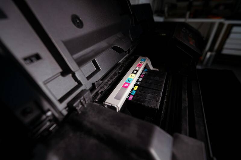
Material and Finish Options for Printing
The choice of material and finish significantly influences the tactile experience and perceived quality of business cards. Standard options include cardstock, which is durable and versatile, available in various weights to suit different styles—from light and elegant to sturdy and substantial. Premium materials such as matte, gloss, or satin finishes can alter both the look and feel of the card. A matte finish offers a subdued, non-reflective surface ideal for readability and sophisticated designs, while gloss provides a shiny, vibrant appearance suitable for colorful graphics and logos. Specialty finishes like soft-touch coatings, embossed elements, or foil stamping can add a tactile dimension and visual interest, elevating your cards to a premium level. These options are especially useful for branding that emphasizes luxury and exclusivity. Furthermore, consider environmentally friendly options such as recycled paper or plant-based materials. These choices can align with sustainability values and appeal to environmentally conscious clients. Choosing the right material and finish should complement your overall brand personality, ensuring your business card makes a lasting impression upon contact.
Understanding Business Card Design
Effective business card design is a strategic process that combines visual aesthetics with functional clarity. The goal is to create a card that not only captures the essence of your brand but also serves as a practical contact tool. A well-designed card reflects professionalism, enhances brand recognition, and leaves a memorable impression on potential clients and partners. To achieve this, attention must be paid to every detail, from layout to material selection.
Choosing Layouts and Structures
The foundation of a compelling business card design lies in its layout. Choosing the right structure involves balancing information hierarchy with visual appeal. Common layouts include horizontal, vertical, and even unconventional formats that can help your card stand out. The key is to allocate space effectively, ensuring that essential contact details such as name, title, phone number, email, and website are prominently displayed and easily scannable.
Utilizing grid systems and alignment techniques ensures that elements are organized neatly, facilitating readability and a polished appearance. Incorporating white space thoughtfully prevents clutter, allowing each component to breathe and emphasizing crucial information. For brands seeking innovation, asymmetric designs or layered elements can add depth, though they should always retain clarity.
Utilizing Visual Hierarchy
- Primary Focus: Company logo and name should be the most prominent elements.
- Supporting Details: Contact information and secondary branding elements posed subordinate to the main identifiers.
- Balance: A harmonious distribution of text and graphics avoids visual fatigue and guides the viewer’s eye naturally through the design.

Selecting Colors and Typography
The color palette and typography choices are critical to signaling your brand identity. Selecting complementary colors that align with your brand guidelines fosters consistency across marketing materials. Bright, bold hues can evoke energy and innovation, while subdued tones convey professionalism and reliability.
Typography should prioritize clarity while reflecting personality. Sans-serif fonts tend to promote modernity and simplicity, making them suitable for tech, startup, or creative industries. Serif fonts, on the other hand, exude tradition and authority, fitting for legal, financial, or academic sectors. Font size and spacing must be optimized for legibility, particularly for contact details.
Color and Font Pairing
- Choose a primary color that aligns with your brand.
- Use secondary colors to support and highlight key information.
- Select two to three font styles to create visual harmony.
- Ensure sufficient contrast between text and background for readability.

Incorporating Logo and Brand Elements
A logo serves as the visual cornerstone of your business card, representing your brand’s identity succinctly. It should be scaled appropriately—large enough to be recognizable but not overpowering the overall design. Integrating brand elements like taglines, icons, or signature graphics further reinforces recognition.
Consistency across all branding channels is vital. Using similar color schemes, fonts, and graphic styles helps establish a cohesive presence. When designing the card, consider placement carefully—typically, the logo resides at the top or corner to anchor the design while leaving room for other vital info.
Using negative space around logo and graphics improves visual focus and creates a clean, sophisticated look. Additionally, textured or embossed logos can add tactile interest, strengthening brand perception upon contact.
Material and Finish Options for Printing
The tactile feel of your business card influences perceptions of quality. Standard cardstock remains popular due to its durability and versatility, available in various weights. Heavier cardstocks impart a premium feel, suitable for brands aiming to convey stability and strength.
Finish choices profoundly impact the visual and tactile appeal. Matte finishes soften appearance and reduce glare, ideal for minimalist, elegant designs focused on readability. Gloss finishes provide a vibrant, reflective surface, accentuating colors and details, making your graphics pop.
Specialty finishes can elevate your cards further. Soft-touch coatings lend a velvety feel, while embossed or debossed elements introduce texture. Foil stamping adds metallic accents that exude luxury. Eco-friendly options, such as recycled paper or plant-based materials, resonate with environmentally conscious audiences and reflect sustainability values.
Finish Options Overview
- Matte: elegant, non-reflective surface, enhances readability
- Gloss: vibrant, shiny finish highlighting colors
- Satin: semi-gloss alternative with smooth feel
- Soft-touch: velvety texture for a premium tactile experience
- Foil stamping: metallic accents adding luxury
- Recycled or eco-friendly materials: sustainable branding
Understanding Business Card Design
Designing a compelling business card requires careful consideration of visual elements, layout, and overall presentation. It’s essential to craft a design that accurately reflects your brand’s identity, communicates professionalism, and leaves a memorable impression on recipients. Consistency with your overall branding ensures coherence across all marketing materials, reinforcing recognition and trust. Consider the core message you want to convey and how your design choices support this objective. Balance is key, as cluttered cards diminish impact, while clean, thoughtfully arranged designs highlight your brand attributes effectively.
Choosing Layouts and Structures
The foundation of an effective business card lies in its layout. Straightforward structures, such as horizontal or vertical orientations, cater to different aesthetic preferences and industry standards. For a minimalist approach, ample white space combined with essential contact details creates a polished look that emphasizes clarity. If your brand features a lot of information, a grid-based layout helps organize elements systematically, making the card easy to scan. Some designs incorporate creative use of asymmetry or diagonal lines to add visual interest, but these should not compromise readability.
Selecting Colors and Typography
Color choices should align with your brand palette, conveying the desired emotional response and maintaining consistency across various touchpoints. Subdued tones suggest professionalism and elegance, while bold colors can make your card stand out. Typography also plays a vital role; choosing legible fonts that mirror your brand’s personality is crucial. Sans-serif fonts tend to offer a modern, clean appearance, suitable for tech or innovative companies. Serif fonts evoke tradition and authority, fitting for legal or financial services. Font size and spacing must ensure readability at a glance, avoiding overly decorative or complex typefaces that hinder understanding.
Incorporating Logo and Brand Elements
The logo is often the visual keystone of your business card, representing your brand identity instantly. Proper placement, typically at the top or adjacent to contact information, ensures immediacy and recognition. Incorporate other brand elements cautiously, such as patterns, icons, or specific graphic motifs, to reinforce brand messaging without overcrowding the design. Maintaining sufficient contrast between logo, text, and background enhances visibility and preserves clarity, especially in print where resolution quality can vary. Non-distracting branding elements can subtly elevate your card’s overall aesthetic.

Material and Finish Options for Printing
The tactile experience of your business card influences perceptions of quality. Standard cardstock remains popular due to its durability and versatility, available in various weights. Heavier cardstocks impart a premium feel, suitable for brands aiming to convey stability and strength. Finish choices profoundly impact the visual and tactile appeal. Matte finishes soften appearance and reduce glare, ideal for minimalist, elegant designs focused on readability. Gloss finishes provide a vibrant, reflective surface, accentuating colors and details, making your graphics pop.
Specialty finishes can elevate your cards further. Soft-touch coatings lend a velvety feel, while embossed or debossed elements introduce texture. Foil stamping adds metallic accents that exude luxury. Eco-friendly options, such as recycled paper or plant-based materials, resonate with environmentally conscious audiences and reflect sustainability values.
Digital vs. Print Business Cards
While physical cards remain a staple for direct networking, digital business cards are gaining popularity due to their convenience and eco-friendly nature. Digital cards can be shared instantly via QR codes, email, or messaging apps, allowing for quick and versatile exchanges. They also enable dynamic content updates, ensuring that contact information is always current. However, printed cards provide a tangible presence, allowing for creative tactile experiences and often leaving a stronger impression. Combining both options can be an effective strategy to maximize outreach and ensure your brand remains memorable across various contexts.
Current Trends and Innovations in Business Card Design
Modern business card design leans toward minimalist aesthetics with bold typography and strategic use of minimal color palettes. Unique shapes and die-cut designs are increasingly popular, capturing attention through distinctive physical form. Incorporating textured finishes, such as embossed patterns or velvety coatings, enhances sensory engagement. Additionally, sustainable materials—like recycled paper or biodegradable plastics—are trending, aligning with eco-conscious branding initiatives. Incorporating technology, such as NFC-enabled cards that connect to digital portfolios or contact details, offers innovative ways to blend physical and digital interactions seamlessly.