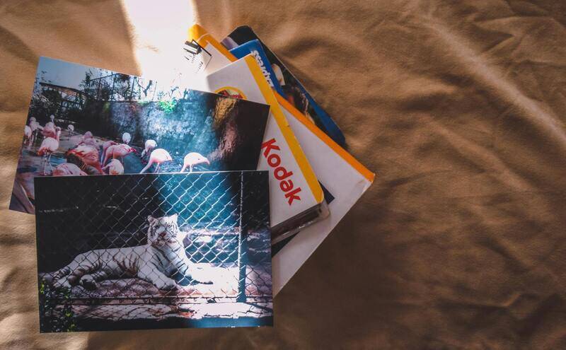
Importance of Colour Brochure Printing
Colour brochure printing plays a pivotal role in modern marketing strategies, offering a dynamic and visually compelling way to communicate a brand’s message. Unlike monochromatic or black-and-white options, colour brochures utilise vibrant hues and rich visuals to capture attention and evoke emotional responses from potential clients. The strategic use of colour not only enhances the aesthetic appeal but also reinforces brand identity, making it easier for customers to recognize and remember a business.
In a competitive marketplace, the visual impact of a brochure can be the differentiating factor that encourages a potential customer to choose one service or product over another. Bright, well-printed colours can highlight key information, promotional offers, or unique selling propositions, thereby increasing the chances of engagement. Moreover, colour brochures lend a professional and polished appearance, demonstrating a company's commitment to quality and detail.
Colour brochure printing also offers psychological advantages, as specific colours evoke certain emotions and associations that can influence purchasing decisions. For instance, blue conveys trust and reliability, while red symbolizes excitement and urgency. By carefully choosing a colour palette that aligns with brand messaging, businesses can form an emotional connection with their target audience.
Additionally, the tactile quality of colour brochures—in terms of paper weight, finish, and print vibrancy—further communicates professionalism and reliability. High-quality colour printing can make a lasting impression, encouraging recipients to keep the brochure for future reference or sharing.
Beyond traditional marketing, colour brochures serve as an essential tool for product launches, trade shows, corporate events, and direct mail campaigns. The versatility and visual appeal of colour print materials ensure that businesses remain memorable amidst a sea of digital advertisements and online promotions.
With the rapid advancement in printing technology, achieving high-resolution, vivid colours has become more accessible and cost-effective. Companies investing in colour brochure printing benefit from a competitive edge by delivering visually appealing marketing materials that effectively communicate their brand story and attract a broader audience.
Design Considerations for Colour Brochures
Creating an impactful colour brochure involves meticulous attention to design elements that work harmoniously to enhance visual appeal and communicate the core message effectively. A well-thought-out layout guides the reader’s eye seamlessly across the content, emphasizing key information while maintaining aesthetic balance. Employing a grid system ensures consistency and clarity, preventing clutter and promoting readability.
Strategic use of white space, also known as negative space, plays a vital role in highlighting focal points and making the overall design less overwhelming. It provides visual relief and directs attention to important images and calls to action. Proper alignment, consistent spacing, and judicious use of typography contribute to a professional appearance that reinforces brand integrity.
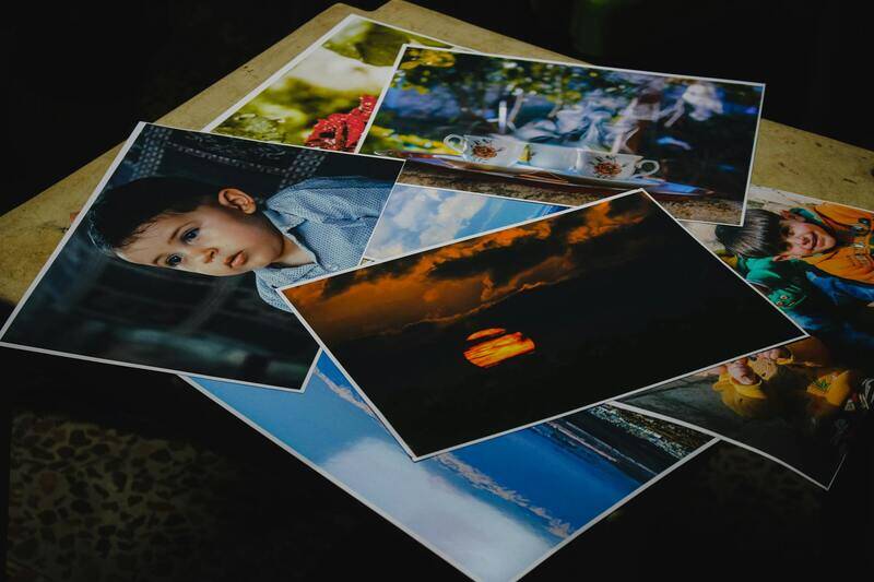
Imagery selection is crucial for conveying the brochure’s message. High-resolution images should align with the brand’s tone and evoke the desired emotional response. Incorporating diverse visuals such as product photos, infographics, and lifestyle images enriches the content and makes it more engaging.
Color schemes must be chosen thoughtfully, reflecting the brand identity and ensuring harmony across all pages. Complementary and analogous colour schemes often produce vibrant, cohesive visuals, while contrasting colours help emphasize important elements. Consistent use of colour palettes strengthens brand recognition and triggers emotional responses aligned with marketing goals.
The typography should be legible and aligned with brand voice. Using contrasting font styles for headings and body text improves hierarchy and guides viewers’ attention systematically. Avoiding excessive font variety maintains clarity and prevents visual distraction.
Additionally, incorporating interactive features such as QR codes can bridge the gap between print and digital platforms, encouraging further engagement. Overall, the design must be cohesive, visually appealing, and strategically crafted to leave a lasting impression on the audience.
Types of Finishes and Paper Options
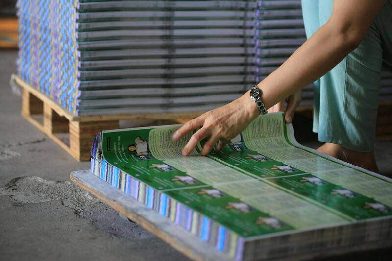
The selection of finish and paper stock is a vital aspect of creating impactful colour brochures. The choice of paper affects both the tactile experience and visual appeal, while finishes add a layer of sophistication or durability. Common paper stocks include gloss, matte, and satin finishes, each offering a distinct visual style and texture. Gloss finishes are popular for vibrant colour reproduction, enhancing sharpness and vibrancy, making images and graphics stand out vividly. Matte finishes, on the other hand, provide a softer, non-reflective surface that minimizes fingerprints and smudges, imparting an elegant, subdued look suitable for text-heavy brochures. Satin finishes combine elements of both, giving a smooth, subtle sheen that balances vibrancy and clarity.
In terms of weight, thicker paper stocks such as 170gsm or higher are preferred for premium brochures, offering increased durability and a substantial feel. Lighter options, around 130gsm, are more suitable for mass distribution where cost-effectiveness is a consideration, without compromising essential visual quality.
Textures also add a tactile dimension to colour brochures, with options like linen or soft-touch coatings. Linen textured paper lends a sophisticated, tactile feel that can convey luxury, while soft-touch finishes make the brochure memorable through a plush, velvety surface.
Choosing the right finish and paper is crucial to align with the brochure’s purpose, whether for high-end marketing campaigns or informative product catalogs. The right combination not only improves the visual impact but also ensures longevity, allowing your printed materials to withstand handling over time. Carefully evaluate the nature of your content, target audience, and distribution method to select the most suitable paper and finish options, thereby maximizing your print investment’s effectiveness.
Understanding Colour Printing Techniques and Quality
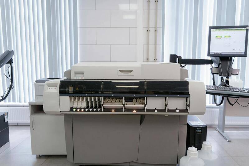
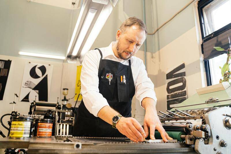
Achieving vibrant and accurate colours in brochure printing hinges on the meticulous selection of printing techniques and quality assurance measures. The most prevalent method used in professional colour brochure printing is the offset printing process, renowned for its ability to produce consistent, high-resolution images with rich colours. This process involves transferring ink from a printing plate to a rubber blanket, then onto the printing substrate, allowing for precise control over colour reproduction.
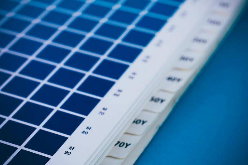
Digital printing has gained prominence for short runs and quick turnaround times. It employs laser or inkjet technology to produce sharp images directly onto paper, with advanced presses capable of colour management that ensures vivid and consistent hues. Both offset and digital methods benefit from colour calibration tools, such as spectrophotometers, which align the printer's output with colour standards, ensuring your brochure colours are true to the original design intent.
High-quality ink selection profoundly influences the vibrancy and durability of the final product. Using UV coatings or aqueous coatings can further enhance colour depth and glossiness, making images pop and text stand out clearly. It's also vital to select a printer with proficiency in colour management standards, including Pantone matching or CMYK calibration, to guarantee that colours remain consistent across different print batches.
Beyond the printing process, quality control measures such as sample reviews and proofing stages are crucial. These steps allow for adjustments in colour balance, alignment, and image clarity before the full run, safeguarding the visual impact of your brochure. Emphasizing quality in colour brochure printing not only enhances aesthetic appeal but also reinforces your brand’s credibility and leaves a lasting impression on your audience.
Types of Finishes and Paper Options
Choosing the right finish and paper for your colour brochure is pivotal in elevating its visual appeal and durability. Finishes not only protect the printed material but also influence the tactile experience, which can significantly affect how recipients perceive your brand. Several options are available, each suited to different objectives and budgets.
Common Finishes for Colour Brochures
- Matte Finish: Offers a soft, non-reflective surface that reduces glare, ideal for highlighting detailed graphics and text. It provides a sophisticated look and minimizes fingerprints and smudges, maintaining a clean appearance over time.
- Glossy Finish: Delivers a shiny, vibrant surface that enhances colour saturation and sharpness. Perfect for image-heavy brochures, glossy finishes make visuals pop and are highly attractive for catching attention from the first glance.
- Satin or Semi-Gloss: Strikes a balance between matte and glossy, providing mild sheen without excessive glare. This finish is versatile and suitable for a wide range of brochure styles, combining visual impact with practicality.
- UV Coating: Adds an extra layer of gloss and durability, protecting against scratches, moisture, and fading. It is particularly effective for high-visibility marketing materials intended for long-term display.
Paper Choices for Colour Brochures
Paper selection influences the tactile feel, weight, and overall presentation of your brochure. The choice depends on the desired finish, portability, and impression you want to leave on your audience.
- Glossy Paper: Provides a shiny surface that amplifies colour vibrancy, suitable for photographic content and eye-catching visuals.
- Matte Paper: Offers a subdued, elegant matte surface that minimizes glare, ideal for text-heavy brochures where readability is paramount.
- Satin or Silk Paper: Combines the benefits of both gloss and matte finishes, offering a smooth and appealing surface for professional-looking brochures.
- Uncoated Paper: Features a natural, textured surface that delivers a premium tactile experience, often used for a more understated, refined aesthetic.
In terms of weight, options typically range from 170gsm to 300gsm or higher. Heavier papers impart a sense of quality and sturdiness, while lighter options are more budget-friendly and easier to handle for bulk distribution.
Eco-Friendly and Sustainable Printing Practices
In today’s environmentally conscious market, prioritizing eco-friendly and sustainable printing practices has become essential for businesses looking to reduce their ecological footprint. Incorporating eco-friendly methods not only aligns with global sustainability efforts but also enhances your brand's reputation among environmentally aware consumers. Recycled paper options are increasingly popular, providing a tangible way to reduce waste and conserve natural resources while maintaining high-quality print outputs.
Recycled papers are available in various textures and finishes, allowing flexibility to match your design preferences. These materials are often processed with minimal bleaching, which reduces chemical use and water consumption during production. When paired with soy-based inks, which are derived from renewable plant sources, the printing process becomes significantly more sustainable. Soy-based inks offer vibrant colours, quick-drying properties, and reduced emissions, making them an excellent choice for environmentally responsible brochures.
Another key aspect of sustainable printing involves adopting energy-efficient practices within the printing process. Many modern printers utilize state-of-the-art equipment that lowers energy consumption and waste production. Furthermore, selecting printers that adhere to environmentally certified standards ensures your brochure printing aligns with best practices for sustainability.
Opting for eco-friendly printing supplies and practices benefits your brand by demonstrating a commitment to environmental stewardship. This approach appeals to eco-conscious clients and partners, broadening your market reach and strengthening your corporate social responsibility initiatives.
Besides materials and ink choices, implementing digital workflows reduces paper waste during pre-press stages. Precise file preparation and proofing processes prevent unnecessary reprints, conserving resources and reducing overall environmental impact.
Many printing services now offer extensive sustainability reports, allowing you to verify their eco-credentials and the environmental benefits of their methods. Choosing a printing partner that prioritizes sustainability helps ensure your coloured brochures are produced responsibly, upholding high standards for both quality and environmental care.

Enhancing Brand Identity Through Professional Colour Brochure Printing Techniques
Choosing the appropriate printing techniques for your colour brochures significantly impacts the visual appeal and overall effectiveness of your marketing materials. High-quality printing methods ensure that colours are vivid, sharp, and true to your design intentions, which in turn reinforces your brand image and message.
Offset printing remains a popular choice for large volume runs due to its cost efficiency and superior colour accuracy. This technique involves transferring ink from a plate onto a rubber blanket, then onto the printing surface, enabling consistent and vibrant colour output. It is ideal for projects demanding precise colour matching and high-resolution detail, making it suitable for corporate brochures, product catalogs, and marketing collateral.
Digital printing offers a flexible alternative, especially for short runs or projects requiring quick turnaround times. Improvements in digital printing technology allow for high-quality colour reproduction comparable to offset methods, with the added benefit of personalized or variable data printing options. This makes digital printing a versatile choice for targeted marketing campaigns or limited editions.
Moreover, specific printing techniques like spot colour printing enable the inclusion of customised, highly saturated colours outside the standard CMYK palette. Spot colours are often used to match brand-specific hues or metallic finishes, adding a distinctive touch to your brochures that can elevate your brand perception.
Employing the right technique involves aligning your project’s goals with the advantages of each process. For instance, offset printing is recommended for large quantities where colour consistency and durability are priorities, while digital methods suit customized or small-volume projects. Collaborating with professional printers who have expertise across multiple methods ensures your brochures meet your standards and effectively communicate your brand identity.
Furthermore, advanced colour management tools, such as ICC profiles and calibrated printers, are essential for maintaining consistency throughout the production process. This accuracy guarantees that the colours printed reflect the original design, providing a visually compelling brochure that captures the audience's attention and enhances brand recognition.
Ensuring Durability and Longevity in Colour Brochure Printing
Achieving vibrant, eye-catching colours in your brochures is vital, but ensuring that these colours remain intact and appealing over time is equally important. Choosing the right ink and finishing techniques can significantly influence the durability of your printed materials. UV coatings, lamination, and matte or gloss varnishes serve as protective layers that shield the brochure’s surface from scratches, moisture, and fading caused by exposure to sunlight and handling. These protective finishes not only prolong the lifespan of your marketing collateral but also enhance its tactile appeal, encouraging interaction and engagement from your audience.
Strategic Colour Management and Quality Assurance
Effective colour management is fundamental to maintaining consistency across multiple print runs, especially when producing colour brochures on a large scale. This involves accurately translating your digital colour specifications into printed hues through calibrated workflows and specific colour profiles. Professional printing services utilize advanced software and hardware to monitor colour fidelity throughout the production process, ensuring that each brochure reflects the original design intent.
Quality assurance measures include rigorous proofing stages, where sample prints are evaluated for colour accuracy, registration, and finish quality. Variations are minimized through careful calibration and standardization, resulting in a consistent product that upholds your brand’s visual standards. This attention to detail guarantees that your brochures will impress recipients with bright, accurate colours that reinforce brand recognition.
Incorporating Additional Elements to Elevate Your Brochures
- Embossing and Debossing: To add a tactile dimension and highlight specific elements, embossing techniques can create raised designs, while debossing leaves impressions below the surface.
- Foil Stamping: Metallic foils can be applied to key areas, offering a luxurious finish that captures attention and aligns with premium branding strategies.
- Specialty Inks: Consider using UV spot inks or textured varnishes to add visual interest and differentiate your brochures from competitors.
Future-Ready Trends in Colour Brochure Printing
Staying ahead in the competitive landscape involves embracing innovative printing techniques and sustainable practices. Digital printing advancements now facilitate the production of environmentally friendly brochures without compromising colour vibrancy or quality. Fast, eco-conscious options such as water-based inks and recycled paper stocks are increasingly accessible from professional printers.
Moreover, the integration of augmented reality (AR) features into printed brochures is expanding the potential for interactive marketing. When combined with vibrant, high-quality colour printing, AR elements can provide a layered digital experience that captivates audiences and fosters deeper engagement with your brand.